Google Display Ads are a great way to build your brand and reach new audiences – but how can you make the most of your campaigns? We’re here to help.
Keep reading to find out about Google Display campaign best practices, or click the links below to find a specific section:
- What are Google Display Ads?
- Uploaded vs Responsive Display Ads
- Our advice on digital marketing banner ads
- Uploaded Display Ads – best practices
- Designing Google Ads without a designer
- Google Responsive Ads – best practices
What are Google Display Ads?
You’ve most likely seen these types of ads in your day-to-day internet surfing. Google Display Ads are the adverts you see either on the top or side of a webpage. Essentially, they’re visual banners that advertise a product or service, even if you’re not on their website.
Google Display Ads are totally different from Search ads, which are based on keywords, intent-based marketing. Display ads, on the other hand, rely on the client building out audiences based on in-market, or how they’ve engaged with your website app or service. It’s a push-marketing tactic, as you’re literally placing your brand in front of users by using visual aids.
Are Google Display Ads worth it?
In short – yes. Google Display Ads help you build a valuable, recognisable brand and good brand recall. This means that, by creating digital display banners that truly represent your business, users are more likely to remember who you are, and your product/service.
Google Display Ads are served on the Google Display Network, a network of over two million websites and apps that reaches somewhere in the ballpark of 90% of internet users. There are 33 dimensions of display placements, meaning that there’s plenty of opportunity to serve a variety of ads across different platforms. Just some of these platforms include:
- Third party websites e.g. The Guardian, The Times
- YouTube
- Gmail
- Mobile phone apps
You can set up multiple campaigns for different goals running alongside each other, such as brand awareness, lead generation and traffic. However, it’s worth noting that spend can easily run away if you’re not careful. We recommend keeping a close eye on your ads to ensure you’re bringing in great results within your budget, or hire a Paid Media expert to do this for you.
Remarketing Display Ads
Banner ads in digital marketing also work as a strong remarketing tool. This is because these ads serve as a visual reminder of your business. You segment different audiences by action, creating specific Display Ads that target users who previously visited your website. By seeing digital banner ads after having already looked at your product can push users closer to making a purchase.
Google Display Ads for Ecommerce:
Display Ads can also be a valuable asset for ecommerce sites:
“If you’re thinking of using Display Ads to sell something on your e-commerce site, we recommend using them as part of your retargeting strategy. That way you know your Display Ads are being served to a warm audience who have interacted with your website, brand or products in some way. If you’re trying to make contact with customers for the first time, you may find Google Shopping and Google Search more valuable as you’ll be able to reach those who have high intent (that is, actively looking for your product or a similar product).”
Dan Waller
Uploaded vs. Responsive Display Ads
There are two types of Google Display Ads – Uploaded and Responsive.
Uploaded Display Ads use images fully designed by you before uploading them to Google Ads. This means that you’ll need to build all elements of the campaign yourself – including the creative and copy. When creating these images, there are certain dimensions and best practices that you should follow to ensure that your banner ad designs look and perform as well as they can (Jump to Google Responsive Ads best practices). While this ad format gives you more creative control, they’re also more work.
Responsive banners are ads automatically created by Google, using assets that you provide. This means that these ad types are significantly less work, but, as you can imagine, give you less authority over what the ads look like and how your brand is represented
To create Responsive Display Ads (RDAs), you input a number of different headers, descriptions and images to be used in the ad. Google will run and test various combinations of the three, optimising the creative to push that which performs best. This means that Google’s automation does most of the heavy listing when it comes to learning and serves ads that users are responding to.
Uploaded Ads were the original format, but now Google is favouring Responsive Display Ads, as the search giant continues to focus on automation.
The pros and cons of Uploaded Display Ads
When it comes to banner ad design, Uploaded Display ads should be your go-to. It’s an opportunity to really showcase your brand while having fun being creative!
Benefits of Uploaded Display Ads
- Enforce your visual brand
- Include exactly the information you want
- Can be static or animated
Cons of Uploaded Display Ads
- Needs pre-made artwork
- Takes time to build out assets in varying sizes
- Can’t see what messaging/images resonate most with your audience
Benefits of Responsive Display Ads
- Are quick to create and set up
- Have visibility for every banner size
- Accessible for people without existing assets or access to a designer
- Algorithms and learning will serve top performing combinations of titles, CTAs etc.
Cons of Responsive Display Ads
- You won’t have control over how your brand assets (i.e. logo and core colours) are used
- Will look similar to competitors using Responsive ads
Our advice on digital marketing banner ads
When it comes to deciding between the two ad formats, we recommend using both to get the best of both worlds. This strategy gives you the power to introduce your brand to large, relevant audiences, reaching them at the right time. Our PPC and Biddable Media expert Dan explains why:
“Using both Uploaded and RDAs enables you to create ads that reflect your brand assets, alongside more flexible ads that self-learn and optimise.”
– Dan Waller
The important thing is to go with whatever works for you. If you go with Uploaded, make sure you have the time and resources for the creative. If you go with Responsive, you’ll need to monitor spend and keep an eye on performance, to ensure your ads are performing as well as they can.
You’ll also need to stay on top of the latest trends and algorithm updates. Google makes many changes throughout the year, so you’ll need to keep an eye out for any changes and new features.
Uploaded Display Ad creative – 10 best practices
To host successful Uploaded Display Ad campaigns, you need to have effective banner ad designs. Here are our best practices for creating Uploaded Display Ad creatives.
1. Focus on the top-performing Google Display Ad sizes
Google has a range of dimensions you can choose from for your banners. To ensure your imagery looks fantastic on different websites and platforms, make sure to focus on the best Google Display Ad size.
Google has listed their ad specs here, but we’ve compiled our recommended sizes below:
- 250 x 250px – Square
- 200 x 200px – Small Square
- 468 x 60px – Banner
- 728 x 90 – Leaderboard
- 300 x 250 – Inline Rectangle
- 336 x 280 – Large Rectangle
- 120 x 600 – Skyscraper
- 160 x 600 – Wide Skyscraper
These popular display ad sizes cover a range of ratios in both vertical and horizontal formats, which means your ads will cover placements in various positions on site pages (such as header banners or embedded within text). They are also all optimised for Google, so can be served when someone is browsing on a mobile device or tablet.
The Inline Rectangle (300 x 250) is regarded as a bit of a classic, and is highly popular. Its compact rectangle size offers clear space for images and text, and their ability to be embedded within text (such as a blog piece or news article) allows them to stand out when the user is scrolling through a page.
2. Use your brand colours
Staying on brand will help you create brand awareness when users see your ads across different platforms and areas. The colours you use will become associated with your brand, making it easier for users to recognise you when they see your products popping up as you browse online. Your ads will then stand out to your audience more, and your brand will stay consistent as you continue to grow.
3. Avoid blank space
Display banners are real estate, so you need to make the most of the space. Google says that images “should not take up more than 80% of the image,” as your product or service needs to be the focus:
“The subject of the image should be the main attraction, and it should occupy more space to be visually salient and easier to see on smaller screens.”
This makes it easier for users to understand what it is you’re selling, and helps with brand recall later on.
However, it’s also worth playing around with generous border sizes around text and images. Don’t be afraid to leave some blank space to ensure different elements of text and images can be easily read or understood. Use blank space to contrast against other visual / text elements to ensure they stand out / are eye-catching.

4. Add a border if you need to
Display banners with a white background can easily disappear into the website on which they’re being shown. Use borders to clearly show that a user is looking at an ad and not another section of the website. Google has compiled the steps to do this here.
5. Include your logo
Users are not going to know who you are if you don’t include your logo. Your logo should be prominent on your ad and the first thing a user sees. Sticking with brand colours and messaging will only get you so far if the user is struggling to know your business name.
When uploading your logo to the Display Network, we recommend using a PNG logo on a transparent background. You also shouldn’t layer logos on top of other images, although integrating them into a photo is fine. The user must be able to read your ad easily, and piling images on top of each other will not help. The image should, of course, be high quality and in focus.
6. Use a simple font
As with any graphic, the font you use should be simple and easy to read. If a user struggles to make out what you’re saying, then they’re unlikely to understand exactly what it is you’re selling. Try and use a font that matches your brand to enforce brand recognition and use only a small amount of text.
7. Keep it simple & focus on one message
The key thing to remember when Google Ads banner design is to keep it simple – you don’t need to include everything! Take it right back and think about your audience. Consider:
- Do they already know your brand? If so, to what level?
- Are they cold leads?
- What do you want to achieve with your ad banner?
Remember – your landing page will contain all the information users need to convert. So you don’t need paragraphs of texts and images for every product/service you provide in one ad. You just need enough to persuade users to click through your landing page. Keep it short, sweet, and to the point.
If you’re struggling to fit all valuable information on one ad, then try using animated banners and slides instead.
8. Include a CTA
As we mentioned above, your user needs to click through to your landing page. But how are they going to do that, when they don’t know how?
Think of what you want users to do when they see your banner ad. How can you entice them into doing just that? Phrases such as ‘Shop now’, ‘Learn more’, ‘Contact us’, and ‘Get a quote’ usually work well. Whichever phrase you choose, make sure it’s direct, clear, and compelling.
Ideally, the copy in your ad should let the user know what exactly they’d receive if they buy from your business e.g. a product, discount, blog/whitepaper, so your CTA should be the thing that pushes them into purchasing. Make sure the CTA button is clear and stands out.
9. Use the right Google display Ad format & file size
Your ads aren’t going to look good if they’re not the right size. So when you create an ad banner online, make sure you use the right Google Display Ad file size:
- Formats: GIF, JPG, PNG, SWF, ZIP
- Max. size: 150KB
10. Test different messaging
You never know which ads are going to be your most successful if you don’t test. Messaging is important – you need to speak your audience’s language. So try out different messaging and run ad sets concurrently to see what works and what doesn’t.
However, you must make it a fair test. If you’re testing messaging, keep the design the same and just change the copy. Once you’ve identified the best-performing headline, keep everything else the same, but then test the CTA.
It’s all about testing each part of your ads in isolation – that’s how you can clearly see which options will work for you.
Google Display Uploaded Ad Examples
When it comes to banner ads in digital marketing, we know what we’re doing (if we do say so ourselves!)
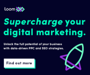

You can see how we used Google display best practices in our above ads. We keep designs simple and graphics-led, rather than image-based. We included contrasting brand colours (i.e. a dark background with light text) to ensure that the ads are readable in all sizes.
You should always include your logo for brand recognition, but the core messaging and CTA should take centre stage – this is the hook that will drive users to your website and perform a valuable action.
Including animated elements (such as movement within text) is a sure way to help your brand stand out against static ads that may be served against yours. It might make the design process slightly more complex, but once you have a template built that works, you can reuse this for different messaging.
Designing Google Display Ads without a designer
You don’t need a professional designer to create effective banner ad designs. There’s plenty of software you can use to create ad creatives, including:
- Canva
- Crello (essentially another version of Canva!)
- Photoshop
- After Effects
As we’ve mentioned earlier in this blog, creating your own banner ads can take a lot of time. If it’s something you’ve never done before, it may also take some practice to make designs that really stand out from the crowd.
Here at Loom, we have plenty of experience creating high-performing banner ads that appeal greatly to users. We have access to a wide range of design tools that allow us to produce a variety of imagery for different display ad campaigns. We have a clear understanding of Google banner ad best practices, meaning that we create imagery that both you, search engines, and, most importantly, your target audience will love.
If you want a collection of professional imagery, but do not have the time to create these yourself, then our biddable media experts are here to help. Get in touch to find out more about our Google Display Ad campaigns.
Google Responsive Ads – 6 Best Practices
Responsive Display Ads allow you to create ads in Google Ads, meaning that you have the room to be creative and make the best ads for your business – just with a little more automation from Google’s side.
1. Make the most of multiple Responsive banner sets
With Responsive Display Ads, it’s worth creating multiple campaigns to really make the most of your sets. We recommend segmenting your campaigns by actions and USPs. This means that you’d have a variety of campaigns, such as:
- Brand awareness – introducing your brand to both new or returning audiences
- Remarketing – campaigns specifically targeting users who are almost made a purchase on your site
- A campaign for each USP – why should users pick your business over others? Compile your top reasons and you’ll have a list of various Responsive ad campaigns you can try.
- Actions previously made by the user – this could be pages or sections visited on your website.
2. Use data on what has performed well in the past
When creating Responsive Ads, look at the best performing copy, images and CTAs from previous ads and use this to guide the new build. If you have not run Display Ads before, but have experience with search or social, insights into these campaigns can be valuable in guiding engaging information into the ad design.
Dan has shared further advice for this:
“It’s important to remember however, that Google ranks all ads with a relevant score. Therefore, the copy used in the RDA must connect with the final URL you’re sending your target audience to. For example, say you’re sending someone to a specific clothing brand or service page. You need to include keywords and phrases that match what’s on your website. That way, your users know what to expect when they click on your ad and are taken straight to the relevant information.”
This is a win-win for both you and the user, as it can increase conversion rates by sending users to the page they want to visit quickly and easily – a smooth user experience.
3. Use as many variations as possible
Google automatically optimises your Responsive ads to ensure that they reap the best results possible. One way the search engine does this is by testing multiple campaigns against each other, so it knows which best suits your campaign goals and, therefore, should be prioritised.
You want to make the most of this technique to ensure high performance – you’re more likely to have a successful campaign after Google has trialled and tested various ad styles. We recommend:
- Using all 5 headline and description variation fields
- Using all 15 image slots (if possible).
- 1200 x 628 pixels is recommended – Google will ask you to crop these for portrait and landscape placements once they’re uploaded.
- Adding your logo in different dimensions e.g. square, horizontal/letterbox
4. Choose your CTA carefully
We’ve already highlighted the importance of using a good CTA in your Google Display Ads design, and it’s no different for Responsive Ads.
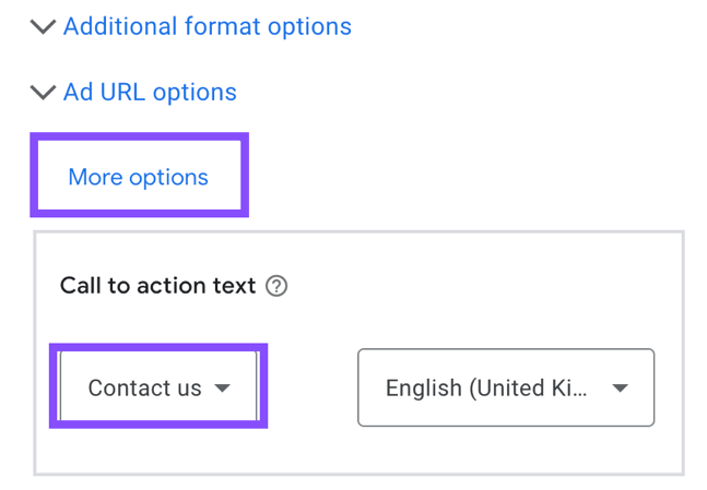
When setting up these ads, Google gives you options to choose from. Some CTA phrases may seem similar at first. For example, ‘Learn more’ and ‘Visit site’ may sound like they could work for a brand awareness campaign, as technically, the user is learning about your brand. However, ‘Learn more’ would be better suited for a content-based campaign, as the user may be finding out more information about a new service.
To summarise, you want to select the CTA that’s most relevant to what you want your users to do.
5. Change the custom colours to match your brand
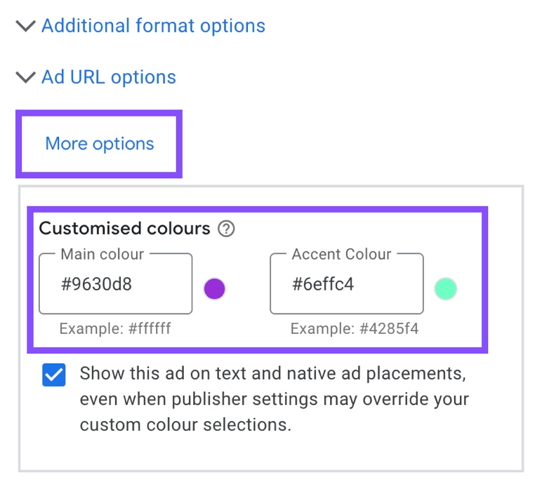
A negative of Responsive Display Ads is that you can lose some of your brand identity. By selecting your brand colours you can inject a bit of individuality to stand out from the crowd, while also building a consistent brand image.
6. Stick with the Responsive Display Ad specs
You want your ads to look as good as possible. The main thing here would be to follow the Responsive Ad specifications to ensure your ads fit the space perfectly.
Standard image sizes (Google recommends including all five of the below, to ensure image optimisation):
- 300 x 250
- 728 x 90
- 160 x 600
- 320 x 50
- 300 x 600
Google Responsive Display Ad Examples
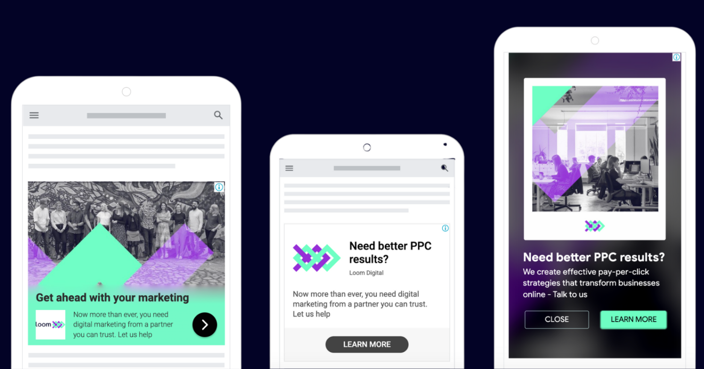
Here at Loom, we’ve also taken the plunge with Responsive Ad campaigns, running them alongside to ensure our clients get the most out of their biddable activity. The below examples are all from one Responsive ad:

Make the most of Google Display Ads with Loom Digital
Display Ads are a fantastic way to share the visual identity of your brand alongside key messaging. And with constant testing and optimising, you can get excellent results from your campaigns.
“Display Ads are essential if you want to re-engage with past users and site visitors, as well as reaching a new audience using audience lists. They can serve personalised text and images that match the past behaviour of users to encourage them to revisit your site and convert.”
– Dan Waller
When it comes to PPC banner design, our biddable media experts have the experience to craft fantastic campaigns that reap results. We take a blended approach to Google Display Ads, utilising both Uploaded and Responsive campaigns to broaden reach and hit the right audiences at the right time. We have all the tools needed to create fantastic imagery that shows off your brand in a stand-out way, and will track performance from start to finish – all so you don’t have to.
Click to read more about our Google Display Ad campaigns, or speak to our team to see how we can create campaigns catered towards your business goals.
