One of the most annoying things that can happen to a user on a website is seeing a dreaded 404 page. In fact, you may have come here from our very own 404 page (we’re sorry) but bear with us, it’ll be worth it when you learn how to turn this UX annoyance into a golden opportunity.
What is a 404 page?
A 404 error is an HTTP status code that occurs when the server can’t find the page requested by a user. Simply put, this happens when a page doesn’t exist or is broken. Out of all the HTTP errors we see online, a 404 is the most common.
404 errors commonly occur when a user types in the incorrect URL, or if a page has been moved or removed and a redirect hasn’t been put in place.
Why are custom 404 pages important?
Some websites try to get around users ever seeing 404 pages by redirecting all 404 errors to their homepage. However, this often results in poor user experience as it doesn’t explain why a user has suddenly landed back on the homepage. Also, it’s not always relevant to the users’ journey. Imagine trying to get somewhere on a website and you keep ending up back at the start – very infuriating.
Although 404 pages can be annoying for a user, you can use them as an opportunity to connect with your audience. Remember, a well-designed 404 page can be the difference between someone bouncing from your website and a happy user. We’ll talk about this shortly.
What 404 errors mean for SEO
404 pages don’t directly affect your website’s SEO. However building a user-friendly 404 page can create a safety net which reduces the number or users leaving your site – something that does have a negative effect on SEO.
Broken links also waste valuable crawl budget (find out more about crawl budget here) and send search engines to dead ends. This means that you’re risking your crawl budget on a muddled journey which could result in them missing your high value pages all together. As a result, they may not get ranked or indexed as they should.
Managing 404 errors on your website
Ideally, there shouldn’t be any links that return 404 errors on your site. But, let’s be realistic – 404 pages are unavoidable. Therefore, it’s important to check for these errors as part of your regular technical website checks.
404 errors can be identified by crawling tools such as:
- Google Search Console
- Deepcrawl
- Broken Link Check.
These tools produce ‘crawl error’ reports which list all server errors on site. When a 404 HTTP error is identified, the report will show you the broken URL as well as the page on which the broken link was found.
Once you have identified all the 404 errors, make sure they’re fixed at the source rather than implementing a redirect. This avoids creating harmful redirect chains.
As the biggest causes of 404 errors are the removal of pages or a change to the URL, it’s important to take this into consideration during any site redesign.
What does Google say about 404s?
You might wonder if 404 pages are bad for SEO if there are too many errors being returned by the server.
However, Google is quite relaxed about how they view 404s, particularly from old websites.
From a recent ‘SEO Snippets’ Google Webmaster’s video, John Mueller, Webmaster trends analyst, advises using 301 redirects to point the old URLs to the new ones. If there are any internal links that point to the old redundant URLs, these should point to the new ones directly.
You may forget about these links overtime or not want to maintain the redirects which means they become 404s and will appear in crawling tools such as Google Search Console.
If they’re receiving low or no traffic and there are no relevant backlinks to them then having those pages return a 404 is fine and they won’t negatively affect your site in search.
However, It’s important not to forget about 404s on other sites that you may be linking out to. This can negatively impact your rankings, so it’s important to carry out site audits regularly to keep track of broken external links.
What a 404 page means for users
Landing on a 404 is annoying and in worst cases can be a brand turn-off or lead to a bounce. It’s not ideal. The goal of the 404 page is to keep users on your site even if they land on a page that doesn’t exist.
Creating a custom 404 page will help:
- Reduce bounce rates
- Keep people engaged and onsite
- Show them your brand personality
- Remind them that you’re human, just like them
How to turn 404 errors into conversions
The aim of your 404-page design is to turn that potential negative user experience into a positive one. With a few simple updates you can turn a lost user into a customer.
The best 404 pages include:
An explanation
It’s important to tell users why they’re seeing a 404 page. For example “This page does not exist or may have moved”. Remember, not everyone knows what a 404-error means and they may be confused as to why they’re not seeing the content they wanted.
Be empathetic – you know that this isn’t what they wanted to see. As well as making your page more personable, it’ll also show that you’re human by addressing the mistake. You can also make the language in line with your brand’s tone of voice.
Navigation links
Once someone understands why they’re seeing this page, tell users how they can continue their journey by including nav links. Instead of closing the window or navigating away from your site, the user can find helpful and potentially relevant resources on another page.
As some of you will have seen, we decided to direct you to this helpful Guide to 404 errors page from our 404 page.
Strong branding & personality
By using your brand’s personality and look and feel, you can help a user become invested in your brand, regardless of what page they’re on.
Many brands turn to humour on their 404 pages and, if your brand allows, it’s a good way to re-engage your users with your brand.
Be engaging
Yes, it’s an error, but your 404 page can be whatever you want it to be. Think of something different to engage your user. It could be a video, something that makes them laugh, something to inspire, even a helpful article like this one.
If you’re a B2B brand and think that this is just for B2C brands, then think again! Engaging 404 pages can be created to suit any business, whatever industry you’re in. We’ve included some examples below to prove it…
Some of our favourite 404 pages
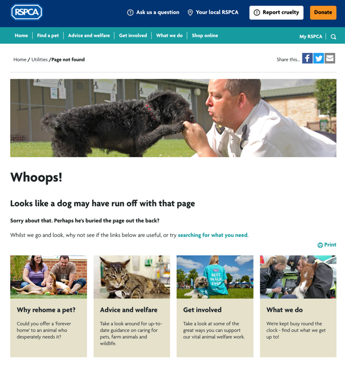
RSPCA
The RSPCA’s 404 page is bang on-brand with their messaging. It’s humorous, endearing and gives the user lots of alternatives to continue their journey.

innocent Drinks
Known for their strong brand identity, innocent have gone one step further and included an on-brand video on their page. It’s slightly off the wall meaning it’s perfect for them.

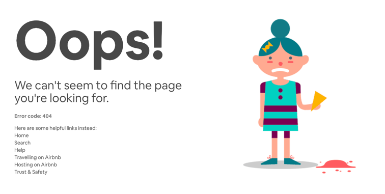
Airbnb
In keeping with their minimalist branding and clean look, the Airbnb page plays the empathy card with their image and provides help links to other useful areas of the site.

Helping you turn lost users into loyal customers
Our experienced team of creative and SEO experts can help design a UX friendly, SEO optimised 404 pages, alongside maintaining the technical health of your website, especially during a website redesign project. Contact the expert team at Loom today on 0117 923 2021.


